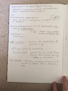
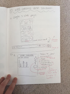
Photographs of sketchbook used for 501:
Showing posts with label 501. Show all posts
Showing posts with label 501. Show all posts
Wednesday, 6 May 2020
Friday, 1 May 2020
Making Pop-ups to Match Brand Guidelines
What to put on pop ups?
- Air vs Boat
- Food shopping with different shipping
- Eco friendly alternatives for clothing
- Food with fewer air miles, more local
- Travel using public transport or walk rather than drive
Air Miles vs Boat or Train
> How much CO2 is produced when shipping cargo by these methods?
IN CONTEXT:
- Air vs Boat
- Food shopping with different shipping
- Eco friendly alternatives for clothing
- Food with fewer air miles, more local
- Travel using public transport or walk rather than drive
Air Miles vs Boat or Train
> How much CO2 is produced when shipping cargo by these methods?
2 tonnes of freight carried 1,000 km produces:
by air – 4,138 kg CO2
by diesel train – 42 kg CO2
by container ship – 30 kg CO2
by diesel train – 42 kg CO2
by container ship – 30 kg CO2
and
2 tonnes of freight carried 5,000 km produces:
by air – 6,605 kg CO2
by container ship – 150 kg CO2
(https://www.airportwatch.org.uk/air-freight/carbon-emissions-of-air-freight-compared-to-other-modes-of-transport/)
by container ship – 150 kg CO2
(https://www.airportwatch.org.uk/air-freight/carbon-emissions-of-air-freight-compared-to-other-modes-of-transport/)
> Should also have praise pop ups for when desired behaviour is made.
- These can contribute to the tracker, if you select walking straight away you will make progress on the tracker via app or website.
DESIGN:
- These can contribute to the tracker, if you select walking straight away you will make progress on the tracker via app or website.
DESIGN:
 |
| Re-thinking the layout, this brings more attention to the text but is confusing as to what is an option to click what isn't? |
 |
| Long, thinner title fits the portrait layout more. and scribble being outside the title bubble works well. It feels much more balanced as a pop up. |
IN CONTEXT:
> When placed initially on the page it didn't looks too good, hey felt clunky especially the food one.
> The food pop up looks a lot more like an ad, when talking with my peers they said this would make them more likely to click off the page rather than engage with the content.
- Need to alter this, maybe don't display the information from the website, could edit in some way.
> Updated, the curved edges look a lot less harsh, simple change with a big impact.
> Having the scribbles spill over the pop up onto the page is another simple change that stops them from looking as though it doesn't belong on the page.
> The food shop one looks much better, the wine bottle and information looks much more cohesive with the pop up and less like an ad.
Thursday, 30 April 2020
Finalised Slides for App and Web
Translated the layout to suit app format.
The download page was very simple to do as not too many things needed to be reconfigured.
When altering the website function to app function this was much more difficult to achieve, some alterations were made to ensure it worked as cohesively as possible.
App Download/opening page slides:
Then for using the app (function):
Animated video of the app:
Download Web Slides:
Then for using the website (function):
The download page was very simple to do as not too many things needed to be reconfigured.
When altering the website function to app function this was much more difficult to achieve, some alterations were made to ensure it worked as cohesively as possible.
App Download/opening page slides:
Then for using the app (function):
Animated video of the app:
- Aesthetic is a combination of what I had worked on last time.
- The black background was a really good selling point for the brand as well as being more environmentally conscious.
- Experimented with simplifying down, without the scribbles, however this made the whole platform look much sinister due to the black background.
- Found keeping the black background but reducing the intensity of the scribbles to be the best combination.
- The way the app works was kept as clean as possible, not too many different options to click, consistent "menu" in bottom right at all times.
- Selected options are highlighted to make you know which one you're on etc.
Download Web Slides:
Then for using the website (function):
Animated video of the app:
> Final outcome incorporates theory from research within design choices and of context.
- Demonstrating others are using the app to develop social norms, encourage more to use the app.
- There are options for users to find out more information if they wish, audience won't be exposed to distressing facts and figures if they don't want to.
- The premise of the app is to provide sustainable alternatives at the time of need, this massively related to Mohr (2012) from essay research.
Subscribe to:
Posts (Atom)
Initial Research Reading
Potential Questions: How can we use the tools of graphic design to develop publications that aid learning? How can different design c...


