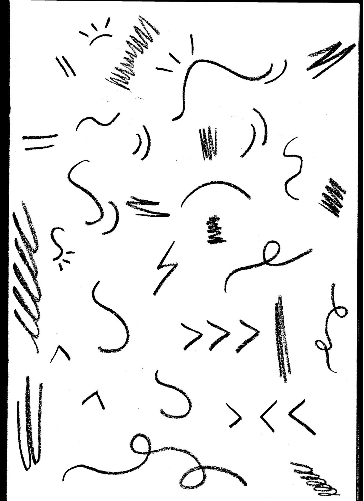
- Introducing more organic shapes to prevent the aesthetic from looking intimidating or harsh.
Tests for Pop-up:
 |
| (1) |
 |
| (2) |
 |
| (3) |
 |
| (4) |
 |
| (5) |
 |
| (6) |
- Feel like some are looking too busy (1,2,6), they're distracting from the message.
- (5) is very simple, feel like it wouldn't distract and the message is clear. Also (4) has a similar effect. Need to put them into context to see what works, what doesn't and what needs changing.
- Need to think about how it would work as well, maybe the options (okay, no thanks) should appear a couple seconds later to ensure the audience reads the text?


- Feels as though they both fit into google maps well.
- I feel the more minimal the more it will not contrast with other websites, apps etc.
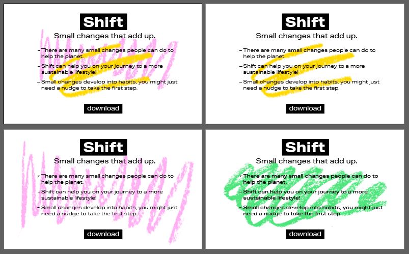
Below are ideas for the page where people download the google chrome add on.


- The use of colour is minimal but brightens up the vibe more, prevents it from looking too serious.
- I feel the chinagraph scribbles add some fun and work well to highlight or separate up text.
- Feel this is going on the right track, it need more experimenting with to see where it could go. The icons idea also needs further developments.
Thinking about the type:


All of the experiments above feel like they're either over complicating the style, or make it look too childish and would seem like it is something for children.
- The original typeface used seems the most appropriate (aktiv).

^ Tested using just the scribble shapes, i think this is looking nice, simple, not intimidating.
- Has a very childlike feel to it through the use of chinagraph. Not sure which is more successful, need to talk to peers.

^Further experimentation with this idea, stripping back making as simple as possible.
- Introducting more hand drawn elements etc, as well as real photos, this was something I found on ecosia as well as other eco sites. I think it shows transparency of the company and makes the audience trust it more.
Research into ways to reduce the amount of power being used by phones, laptops etc. I found that phones use less battery when displaying darker images as the pixels are actually off (due to the screen being a AMOLED/OLED screen).
For other items of tech it seems as though black imagery might not always use less energy, but I didn't find any info that suggested a white screen would use less energy.
- Make background black?

No comments:
Post a Comment