Needing to be very clear on what I'm making for the app/web plug in.
Made wire frames/quick sketches of what the process of using the media would be to ensure I have all the elements:


Need to make:
Web:
1. Download page
2. T&Cs page
3. Landing page
4. Homepage
5. Progress tracker:
- homepage
- water tracker
- co2 tracker
- overall progress
6. Pop ups
App:
1. Download page
2. T&Cs page
3. Landing page
4. Homepage
5. Progress tracker:
- homepage
- water tracker
- co2 tracker
- overall progress
6. Pop ups
Refining Aesthetic:
- Wanting to retain the fun feel to the work to make the topic seem less intimidating, but refined enough to look as though it has been considered.
- Developing a set of design rules or guidelines could be a good way to make sure everything is consistent.
 |
Adding in icons to a more simplified layout, fewer scribbles trying not to distract from the text and what it's saying.
- Having a more organise layout for the text allows the audience to predict where it is going to be. |
 |
Original layout but with the inclusion of icons/illustrations. Again trying to bring attention back to the text as feedback demonstrated the scribbles were distracting.
- Still quite overwhelming, the text is being eaten by everything else on the page. |
 |
| Original layout with no changes. People felt the scribbles were the main focus and drew attention away from the text. Need to figure out a way to counteract this. |
 |
Using the scribbles behind key pieces of text, could be used as a way to highlight information. Take hold of the fact people find the eye catching and put them where the attention is needed.
- Feel like this is working better, still needs improvement, perhaps with illustrations too, maybe draw them out to look less robotic?
|
Refining website:
Homepage:
 |
| Initial thought of having articles and images on the front, however, this goes against a lot of the research I've done. It presents information that might turn people away or discourage them from taking action, pushing people out of their window of tolerance. |
 |
| Decided to go with a simple opening page, nothing to scare only inform. Keeping it simple to help people of all ages navigate the site. |
Tracker:
 |
| Being able to track CO2 as well as water saved b using the app. Landing page where you can choose which one you want to view. |
 |
| Developing the idea of having a goal. Zoe suggested in a crit that there be a opening page that sets you a goal, people may be more interested in something like this than the stats. Creates a sense of reward. |
 |
Experimented with hand drawn circle and just looked clumsy, not appealing at all.
Decided to go with the circle design similar to Clue, it is less threatening and fits on the page well.
|
Displaying the information:
 |
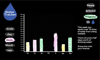
Using a bar chart to show the amounts of water saved on different days of the week. Original design, peers said it wasn't visually engaging.
The notes on the side encourage the behaviour, make the audience see their actions having a positive impact.
- Need to make the content more visually engaging, but still demonstrate the quantitative data well.
|
 |
Trying to display the information in a different way, thinking about presenting the same graph style information but in a different layout.
- Really doesn't suit the page, too thin so leaves a lot of odd space around it.
- There is a lot if individual items on the page, all looks very bitty making it difficult to navigate.
|
 |
Thinking back to the circle design, using this to represent the information, kind of like a pie chart.
- Looks less intimidating but the information is tricky too understand in this format.
- Feel as though it looks too childish, more like a wheel of fortune due to colour palette.
|
 |
Thinking of working more like a calendar, presenting the information in this format.
- I like the simplicity however it doesn't demonstrate the numbers visually which I think is an important element to have.
|
 |
Similar idea but using an opaque bubble to isolate the information.
- Like this but has the same issues.
- Maybe the bubble idea could be used alongside the bar chart?
|
 |
Bubble used alongside bar chart, it makes it more cohesive and fits with the icons on the sides as well.
- Shows the data visually can see easily which days had more water saved.
- Feel like this is the most beneficial outcome for the trackers.
|


No comments:
Post a Comment